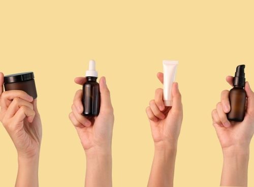

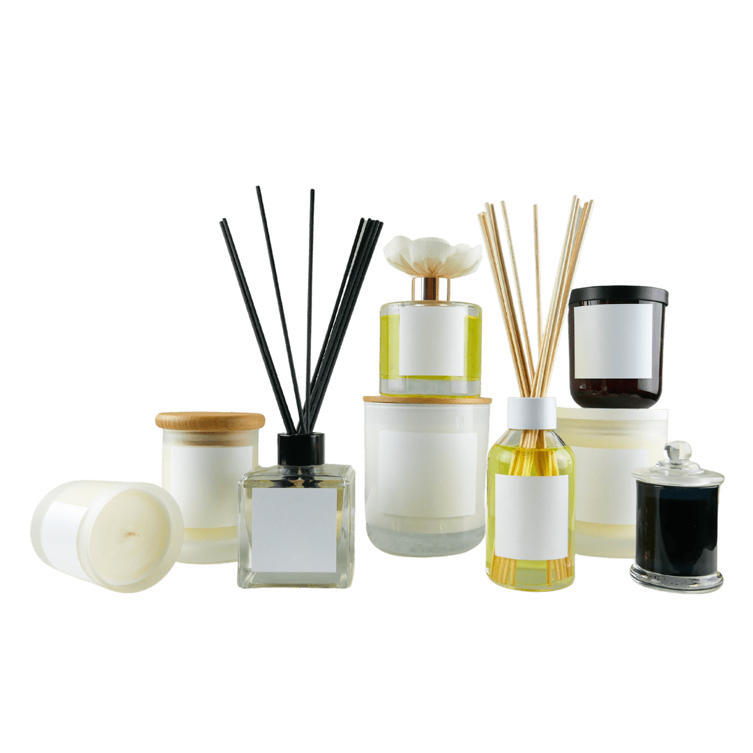
You’ve poured everything into creating a product that feels just right, only to watch the label peel, fade, or worse, misrepresent your brand. That sinking feeling of getting the details wrong after doing so much right? It’s more common than you think and completely avoidable when you know what to look for.
Because here’s the truth: font size, ingredient order, finish, barcode spacing, those tiny decisions carry big consequences. And when they’re off, they can quietly undermine your shelf appeal, confuse customers, or even land you in compliance trouble before your product ever gets noticed.
If you’re a cosmetic brand startup or small business, this directly affects how your customers trust what’s in the jar. We at Miakara help you avoid these hidden traps with lab-tested packaging support, so your product doesn’t just show up – it stands proud.
Misuse of Fonts and Typography
Font size and readability concerns
Labels that make customers squint or second-guess a word instantly feel unprofessional. We see it all the time delicate, decorative fonts that look stunning on screen but fall apart once printed. If someone can’t quickly understand what they’re holding, they won’t keep holding it.
At Miakara, we always start font selection with real-world print testing, prioritising clarity and readability across every label size because beautiful design should never come at the cost of usability.
Poor font pairing and inconsistency
Switching between too many fonts is the graphic equivalent of trying to wear mismatched shoes – it just doesn’t work. Without a visual flow guiding the eye, labels lose credibility. We help clients avoid this by using clear font hierarchies and thoughtful spacing, ensuring a clean, impactful first impression for every customer touchpoint.
Typography ignoring accessibility guidelines
It’s easy to forget that not every customer has perfect vision or lighting conditions. Thin, low-contrast fonts can get lost on busy packaging backgrounds. We always recommend contrast checks under natural and store lighting. At Miakara, accessibility isn’t an afterthought – it’s cemented into every design practice we offer.
Packaging and Label Material Mistakes
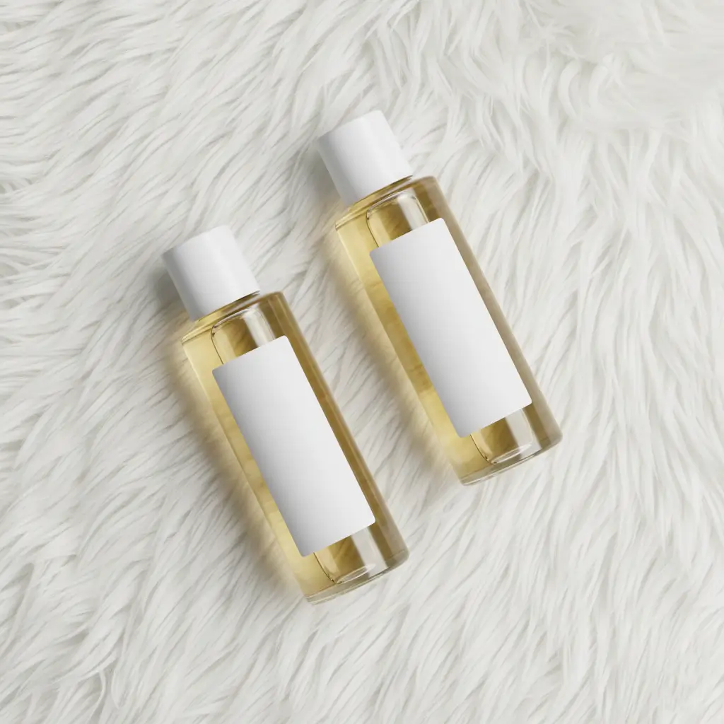
Incompatible label materials for container surface
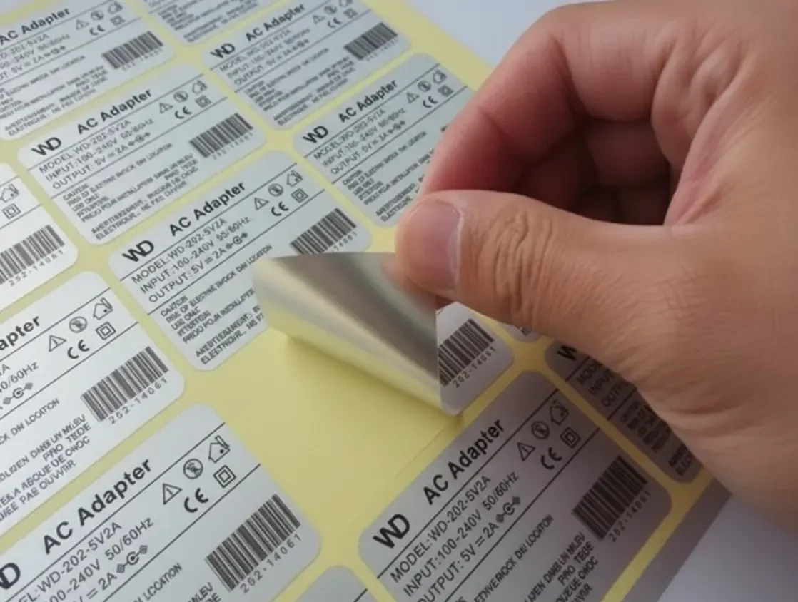
A beautiful label that peels off after three days isn’t doing anyone any favours. Glossy jars and squeezable tubes often reject generic adhesives. We test on actual container types and environments, like bathrooms or handbags, to choose the right adhesive and label stock for durability and appearance.
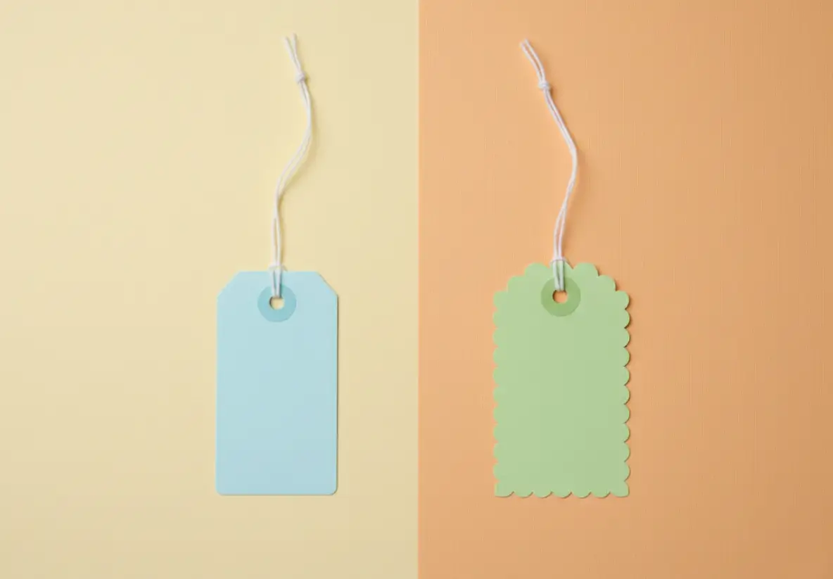
Using the wrong label sizes and shapes
Ill-fitted labels can warp the design, cut off vital text, or simply look awkward. We’ve seen otherwise brilliant branding get compromised by oversized or underwhelming stickers. That’s why we measure every container and print prototype labels to assess how they curve and sit before committing to bulk runs.
Finishing options affecting print quality
Sometimes a glossy or matte finish seems like a great final touch – until text disappears under glare or colours wash out entirely. By offering sample finishes with your artwork, Miakara makes sure your chosen effect enhances, not dulls, your product’s appearance. We check font size, colour balance, and feel before going to print.
Non-Compliance With Labelling Regulations
Omitting mandatory product information
Leaving out basic details like weight, country of origin or batch number can cause shelved stock to be pulled or returned. And trust us, regulators don’t take it lightly. We maintain a compliance checklist tailored for Australian regulations to make sure each product meets legal standards – before it hits the shelf.
Inaccurate or unapproved product claims
Words like “chemical-free” or “dermatologist tested” sound great – but if they’re not backed up, legal trouble’s just around the corner. Miakara guides clients through acceptable product claims and ensures their wording doesn’t overreach or break any advertising rules. We prefer cautious clarity over risky exaggerations.
Poor translation and localisation for Australian market
Imported label templates often come loaded with errors when used in the Australian market. Even a small mistranslation or mismatched terminology can confuse or, worse, offend your audience.
That’s why we don’t just translate; we localise. At Miakara, we ensure your labels align with Australian standards, verifying ingredient lists, descriptions, and phrasing so your products speak clearly to customers and regulators.
Design Issues That Undermine Branding
Colour selection mismatches and poor contrast
What looks soft and muted onscreen can print flat or overly muddy. Color shift happens more than most realise. We always proof colours on the final label material to ensure it reflects your brand’s tone – and demonstrates care and consistency in every shade and font.
Over-cluttered or under-designed labels
Trying to say too much – or saying almost nothing – both affect how a shopper perceives your brand. Labels with too many icons, claims or instructions can overwhelm. Sparse designs lacking warmth or texture feel forgettable. Our in-house designers find that perfect balance between informative and authentic.
Inconsistent branding elements across product lines
Imagine your shampoo looks completely different from your lotion – how would a shopper know they belong together? We standardise your logo usage, colours, and typographic cues so lines feel connected, even if they include several product types. This alignment builds stronger brand recognition and loyalty.
Ingredient List and Consumer Safety Oversights
Misplacement or omission of key ingredients
Active ingredients sell your product, so hiding them or misplacing the list undermines its impact. We follow INCI guidelines and label formatting rules to place each component where it belongs – clear and front-facing if required, especially when it reinforces the product’s purpose.
Failure to highlight potential allergens
Even small traces of nuts or fragrances can cause serious reactions. If your label skips allergen warnings, customers may stop trusting your brand. We help you clearly signal individual hazards and include optional advisory statements that show care even in small print.
Undervaluing ingredient legibility and order
If you can’t read the ingredient list, it’s no good to anyone. Labels should clearly list everything in the right descending order, not a vague or jumbled list. We make sure your typeface, spacing, and print finish let every word stand tall – even on tight corners or small packages.
Common Printing Errors and Workflow Issues
Colour inconsistencies and misalignments
A batch with purple instead of plum or off-centred graphics weakens your brand. These mistakes often happen when print specs aren’t followed correctly. We double-check CMYK and Pantone values, and insist on alignment proofs before signing off large runs – so there are no visual surprises.
Typos and layout flaws missed during proofing
A simple misspelling or an instruction that disappears behind a tear line does more damage than you’d expect. We proof every line, label edge, and icon placement like it’s going on our own shelf – because often, it is. Our clients lean on us for sharp eyes and ready backups.
Ignoring pre-print testing and bulk run reviews
Skipping label trials to save time often leads to wasted product packaging. We offer small batch print previews for approval before your main run. You get a real sense of colour, material, and cut precision before committing to hundreds or thousands of units.
Impacts of Misleading or Vague Information
Claims that fall outside regulatory scope
Phrases like “toxin free” or images that imply medical outcomes invite scrutiny – or worse, complaints. Miakara works with regulatory-savvy partners to review every word and image, so your product remains honest while still appealing. This protects your brand and builds long-term trust.
Lack of clarity in product function or benefit
A label that says “hydrating blend” without context doesn’t help a buyer decide. Shoppers want brief, specific benefits. We tune feature statements to speak plainly, like “softens dry skin” or “removes oil gently.” A well-explained product connects faster and leads to confident purchases.
Non-distinct labels for product types
If every skincare bottle from a brand looks identical, mix-ups become likely. You don’t want someone applying a foot balm to their face. Miakara uses visual coding – like icons, colour bands or targeted copy – to help customers tell products apart without confusion.
Adherence and Durability Shortcomings
Labels that peel, fade, or detach
We know the heartbreak of watching a label slide off in a damp storeroom. Durable adhesives and water-resistant stocks matter. All our recommended materials are tested for moisture, friction, and oil exposure. Because every detail should hold up – just like your product does.
Laminates that compromise aesthetics or readability
Bold fonts buried under glare or fine print distorted by uneven lamination do your product no favours. We use the right laminate textures suited to small fonts and coloured backgrounds – so the final look stays legible and polished under any store light.
Non-uniform positioning of containers
Labels applied at strange angles or with wonky spacing hurt shelf appeal. We use die cuts and pre-applied alignment guides for clean finishes across all products. A neat row of products, properly labelled, tells the customer your brand handles every detail with care.
FAQs
What are the label requirements for cosmetics in Australia?
You must include product name, net weight, full ingredient list (INCI format), batch number, country of origin and business contact. Claims must be substantiated and allergen info clearly marked.
How can I prevent printing issues for large batch cosmetic labels?
Always review a printed proof or small run before mass production. Confirm font size, colours, spacing, and alignment with your supplier to catch errors early.
What makes a cosmetic label trusted by consumers?
Trust builds through clarity and consistency. Use clear claims, readable fonts, accurate ingredients, and a professional layout that matches your overall branding.
Why is label size so important in cosmetics packaging?
Wrong sizes can cut off content or distort design. Correct sizing ensures aesthetic balance, full compliance, and makes your product easier to display and use.
What information is legally required on my cosmetic labels?
Labels must state ingredients (INCI), batch code, product name, net weight, business address and manufacturing origin. Warnings and claims must align with Australian regulations.
A Beautiful Label Can Still Sink Your Brand
You can have the most beautifully designed product on the shelf, but if the label confuses or misleads, trust disappears fast. Customers don’t just remember the look; they remember the clarity, the quality, and the confidence that they chose the right brand.
Printing and labelling mistakes might seem small, but they quietly erode credibility one jar at a time. When every detail is right, your product stops being just another option and becomes the one customers reach for again and again.
We at Miakara support growing brands with label-ready cosmetic products that look sharp and feel right.
Let us help you print it perfectly the first time – reach out to start your label journey confidently.
post comments
Read more like this